Timeline
Winter 2023
Team
Yeseon Kang
Esther Kwak
Steve Celestin
Skills
UI/UX Design
Prototyping
Responsive
Tools
Figma
Photoshop
LG.com UX/UI design enhancement according to the updated visual design guidelines
LG.com Redesign

01. Overview
LG.com UX/UI design enhancement
Goals | Objectives
Engaging digital experience
The goal was to address existing challenges related to grid utilization, branding consistency, visual hierarchy, and outdated design elements and to create a modern, organized, and engaging digital experience that resonates with users and aligns seamlessly with the updated LG design system.
Context
Why updating?
In the last two months, I worked on a comprehensive UI/UX project to enhance the LG.com United States website. The primary objective was to bring the digital experience in line with LG's recently updated design system, as directed by LG headquarters. Recognizing existing UI/UX issues on our current website, we seized this opportunity to address and resolve those concerns.
02. Problem Framing
Areas to improve in current LG.com
The lack of a well-implemented grid system resulted in a cluttered appearance, diminishing the overall visual appeal and cohesiveness of the website.
1. Inconsistent Grid
Problem Context
2. Brand Incoherence
3. Outdated Design Elements
A pervasive inconsistency in branding elements contributed to a diluted brand presence, leaving the website feeling less unified and impactful.
The inclusion of outdated design elements failed to align with modern user expectations, contributing to a perception of stagnancy and potentially hindering user engagement.
03. Design Solution: Homepage
Improvements and core features
03. Design Solution: PLP
Improvements and core features
Updated Mobile - 375px
Updated Desktop - 1536px
The overall changes made included changing the background color to the newly updated light grey (#F9F7F1), refining the product cards, and adding the new category selector.

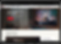
Updated Mobile - 375px
Updated Desktop - 1536px
The overall changes made included aligning all the elements on the grid, changing the background color to the newly updated light grey (#F9F7F1), and adding more interactive elements.

Before the update
Updated Design
Improvements


1. Hero Banner
Similar to the hero section of the homepage, we decided to incorporate a full-sized real-life image to engage users and immerse them in the scene.


2. Promotional Cards
Previously, the promotional cards were placed directly beneath the hero image. However, since the number of these cards could change, and sometimes there might not be any, we chose to integrate them alongside the product cards, ensuring a seamless blend into the content.


3. Header / Filter
Our goal was to give this header a more polished appearance and avoid any sense of looseness. We also focused on enhancing the typography hierarchy to ensure that essential elements are clearly emphasized.


4. Product Cards
To showcase each product more prominently, we reduced cards per row from 4 to 3. We redesigned the size selector to maintain a consistent format even with more than 6 sizes, unlike the previous version where the format changed. Additionally, we relocated the compare button to the top right of the card to avoid displacement caused by the card expansion interaction during hover.

5. Category Selector
Introducing a brand-new section in the updated version of this page - a category selector conveniently positioned just below the hero. This allows users to effortlessly navigate and explore their preferred product types.
Before the update
Updated Design
Improvements
1. Pencil Banner / Nav Bar
The updated pencil banner and nav bar are designed to be less intrusive and more compact.


2. Hero Banner
Instead of an illustration with a shape divider, our choice was to utilize a real-life image that vividly narrates the complete story captured by the content. The aim is to move away from an outdated visual element and use a more authentic and engaging representation.
3. Featured Product Section
As this section is a main promotion, we placed it upfront, enlarged the real-life photo for immediate user attention, and added an interactive plus sign circle for a brief product description and direct access to the product detail page. On the right, two cards provide additional details and visuals of the featured item.


4. Shop by Appliance Section
To enhance the alignment within this section, we opted to box-in all icons and scale them down for a cleaner appearance. Also, rather than using a uniform 'shop now' button, we introduced a subtle card movement on hover to convey that they are clickable.


5. Promo Card
For a balanced layout, we displayed three cards instead of four, preventing cramped contents. We added a tag in the top left corner to highlight special features. Additionally, we resized the vibrant red call-to-action to avoid overpowering the entire card.


5. Information Card
We introduced clickable category cards with a subtle upward movement for enhanced interaction, similar to the Shop by Appliance Section.


03. Design Solution: PDP
Improvements and core features
Before the update
Updated Design
Improvements


1. Sticky Nav Bar
We incorporated a product image alongside its description on the left to enhance clarity for users, facilitating easy identification. Additionally, we applied a blurred lens effect to the background for added branding elements.


2. Product Image
Rather than placing the thumbnail images vertically on the left, we opted to position them below the expanded images, providing a wider frame for a selected image. We also aligned the style and position of the tag and wishlist icon with those used on the product card, ensuring a consistent design system across pages.


3. Product Detail
We made screen sizes more prominent for easier interaction. The button size and layout were adjusted to efficiently accommodate more options in a narrower section, minimizing unnecessary spaces. The active red color has been updated consistently, and subtle grey lines were added between sections to enhance visual separation.
04. Reflection
Thoughts and next steps
1. Product Detail
We made screen sizes more prominent for easier interaction. The button size and layout were adjusted to efficiently accommodate more options in a narrower section, minimizing unnecessary spaces. The active red color has been updated consistently, and subtle grey lines were added between sections to enhance visual separation.
2. Product Detail
We made screen sizes more prominent for easier interaction. The button size and layout were adjusted to efficiently accommodate more options in a narrower section, minimizing unnecessary spaces. The active red color has been updated consistently, and subtle grey lines were added between sections to enhance visual separation.
3. Product Detail
We made screen sizes more prominent for easier interaction. The button size and layout were adjusted to efficiently accommodate more options in a narrower section, minimizing unnecessary spaces. The active red color has been updated consistently, and subtle grey lines were added between sections to enhance visual separation.
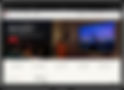
Updated Mobile - 375px
Updated Desktop - 1536px
The overall changes made included changing the background color to the newly updated light grey (#F9F7F1), refining the product detail section in a way that looks cleaner and efficient.

