top of page
01
LG.com
UI/UX • Prototyping • 2024


00
Yeseon Kang
About • 2025


02
LG Staff Picks
UI/UX • Prototyping • 2024


03
Global Payments
UI/UX • Motion Graphic • 2023


04
Inflight Entertainment
UI/UX • Motion Graphic • 2023


05
General Motors
UI/UX • Motion Graphic • 2022


Takeaway
Designing for diverse journeys
Creating solutions for both goal-driven shoppers and casual browsers
pushed me to think beyond a single user path and design for flexibility.
Elevating clarity through structure
Refining layout, hierarchy, and interaction patterns taught me how
thoughtful content organization can dramatically improve usability.
Merging brand and function
Balancing LG’s updated brand identity with practical UX
improvements helped me grow in aligning visual design with user needs.
Reflection
Explorations

[Homepage Explorations]

[Components Experiments]

[Homepage Layout Experiments]

[Hero Banner Templatizing]
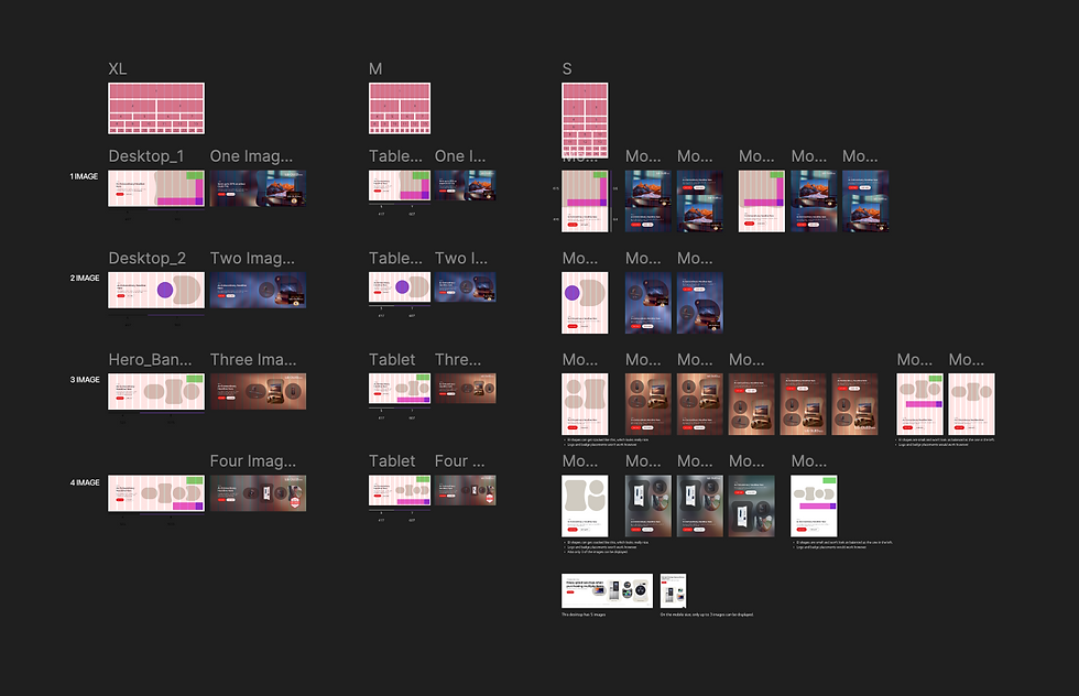
[Responsive Banners]
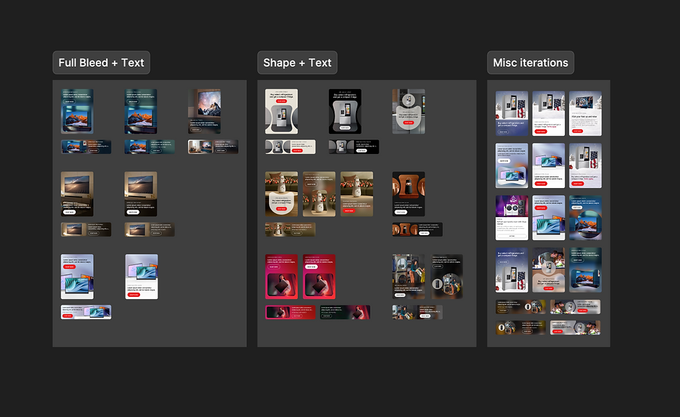
[Promo Cards Experiments]
Process
Design updates
[Home]
Refined hero section - Used branded LG EI shapes and blurred
imagery to emphasize product-lifestyle connection.
Modular layout system - Introduced modular content blocks with
built-in tabbed filters, allowing users to explore categories without
scrolling endlessly or leaving the section.
Category card redesign - Switched from line icons to full-image
cards with hover-state micro-interactions
[PLP]
Visual filter bar - Introduced a horizontal filter bar beneath the hero
section to allow quick, visual browsing by product type.
Product card refresh - Simplified the layout by showing fewer
cards per row, improved size option display, and adjusted
button placement for a more stable interaction.

Solution
The LG.com platform serves a range of users with different shopping goals
and behaviors. To guide the redesign, we created two primary personas
based on interviews and behavioral data:


Users
Through usability testing, internal audits, and user behavior analysis,
we uncovered several recurring pain points:
common painpoints
[Home]
Unclear content structure - Stacked banners and repetitive CTAs
overwhelmed users and made scanning difficult.
Lack of interaction - The homepage offered little interactivity—
category cards were static, and banners didn’t allow users to
explore or filter content, limiting engagement.
[PLP]
Limited category visibility and access - There was no quick, in-page
option to visually browse categories like OLED or QNED, which limited
discoverability and delayed product exploration.
Product card clarity issues - Product cards were difficult to scan and
compare due to cramped layout, formatting inconsistencies when
displaying multiple size options, and layout shifts caused by hover
Interactions.

These insights helped validate that we needed more than a
visual refresh—we needed to rethink the layout and flow.
Competitor Analysis
I analyzed how Google, Samsung, Sony, and Apple design their homepages
and product pages. Their strengths helped shape a cleaner layout that better
showcases LG’s ecosystem.

Research
The previous homepage and PLP lacked structure, clarity, and
engagement. The layouts were content-heavy and visually cluttered,
making it difficult for users to browse or compare products effectively.
Opportunity
We saw an opportunity to redesign these key pages
to enhance product discovery, streamline content,
and build a modern, brand-aligned experience that
was both scalable and intuitive.
Problem
As a UX/UI designer, I worked on the redesign
of LG.com, focusing on improving usability,
visual clarity, and alignment with LG’s
updated brand identity.
Go Back

00
Yeseon Kang
About • 2025
Selected projects
01
LG.com
UI/UX • Prototyping • 2024
02
LG Staff Picks
UI/UX • Prototyping • 2024
03
Global Payments
UI/UX • Motion Graphic • 2023

04
Inflight Entertainment
UI/UX • Motion Graphic • 2023

05
General Motors
UI/UX • Motion Graphic • 2022

bottom of page